Event Website Pages — Speakers, Sessions, Exhibitors & More
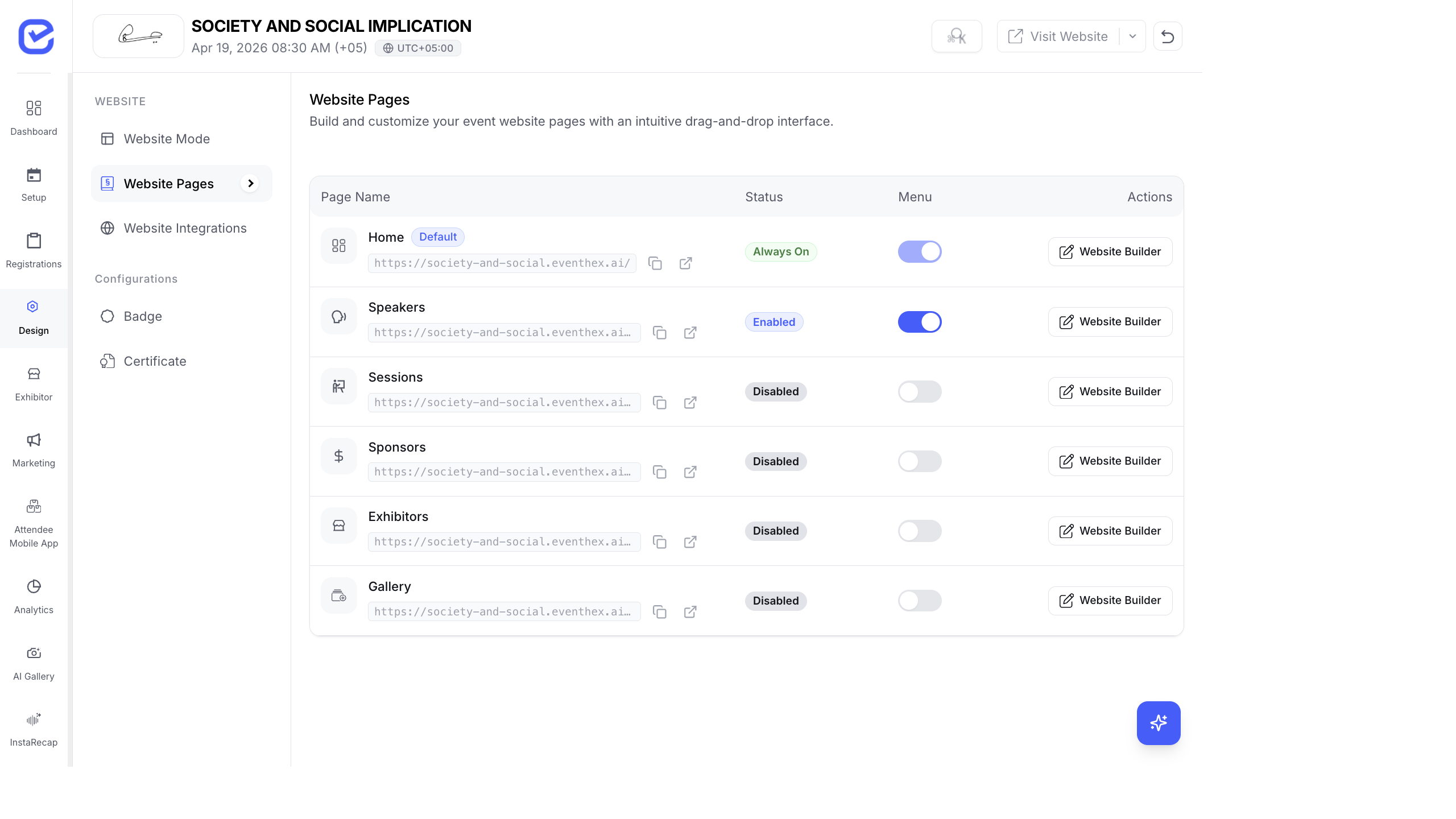
This article provides a detailed look at each individual page on the event website — how the CMS data you enter translates into the pages attendees browse.
Speakers Page (/speakers)
Section titled “Speakers Page (/speakers)”The speakers page is auto-generated from the speakers you add in the CMS.
Layout
Section titled “Layout”- Grid of speaker cards — responsive layout that adapts to screen size
- Each card displays:
- Speaker photo — circular or rounded image
- Name and title — primary display text
- Company/organization — secondary text
- Social links — LinkedIn, Twitter/X icons
Speaker Detail (Modal or /speakers/[slug])
Section titled “Speaker Detail (Modal or /speakers/[slug])”When an attendee clicks a speaker card:
- Full bio — the biography text from the CMS
- Photo — larger display of the speaker image
- Designation and company — professional details
- Social media links — clickable icons to LinkedIn, Twitter/X, etc.
- Sessions — list of sessions this speaker is presenting at, with times and rooms
Data Source
Section titled “Data Source”All speaker data comes from Setup → Speakers in the CMS. See Managing Speakers for how to add and edit speaker profiles.
Sessions Page (/sessions) & Agenda (/agenda)
Section titled “Sessions Page (/sessions) & Agenda (/agenda)”Layout
Section titled “Layout”- Date tabs — for multi-day events, horizontal date pills that attendees tap to switch days
- Track/stage dropdown — filter sessions by room or track
- Session cards in chronological order, each showing:
- Time — start and end time
- Title — session name
- Stage/room — where the session takes place
- Session type badge — color-coded label (Talk, Panel, Workshop, Networking, Break)
- Speaker avatars — small circular photos of assigned speakers
- Description preview — truncated session description
Session Detail
Section titled “Session Detail”Clicking a session opens the full detail:
- Full description
- Speaker list with photos and bios
- Engagement tools — active polls, Q&A, and feedback (if enabled)
- Add to schedule — bookmark/favorite the session
Data Source
Section titled “Data Source”Session data comes from Setup → Sessions in the CMS. See Adding Sessions for setup.
Exhibitors Page (/exhibitors)
Section titled “Exhibitors Page (/exhibitors)”Layout
Section titled “Layout”- Exhibitor grid — company cards in a responsive grid
- Each card shows:
- Company logo — uploaded in the exhibitor profile
- Company name
- Booth number — assigned in the CMS
- Category badge — exhibitor category
- Package tier indicator — visual distinction for Platinum/Gold/Silver
Exhibitor Detail
Section titled “Exhibitor Detail”Clicking an exhibitor opens their full profile:
- Company description — rich text from the exhibitor’s profile
- Company logo and banner — branded images
- Booth location — booth number
- Product catalog — products added by the exhibitor with images, descriptions, and brochure links
- Team members — booth staff listed (if enabled)
- Contact information — website, email, phone
- Social media links
Data Source
Section titled “Data Source”Exhibitor data comes from Setup → Exhibitors in the CMS and from exhibitor self-service via the Exhibitor Portal.
Sponsors Page (/sponsors)
Section titled “Sponsors Page (/sponsors)”Layout
Section titled “Layout”- Tiered display — sponsors organized by sponsorship level
- Platinum sponsors — largest logos, top of page, potentially with descriptions
- Gold sponsors — medium-sized logos
- Silver sponsors — smaller logos in a denser grid
- Other tiers — custom tiers appear in order of priority
Sponsor Detail
Section titled “Sponsor Detail”Clicking a sponsor shows:
- Company logo and description
- Website link
- Sponsor tier/category
Gallery Page (/gallery)
Section titled “Gallery Page (/gallery)”The gallery page displays photos from the AI Photo Gallery module.
Layout Options
Section titled “Layout Options”Depending on the Page Builder configuration:
| Layout | Description |
|---|---|
| Grid | Standard photo grid with equal-sized thumbnails |
| Masonry | Pinterest-style layout with varying heights |
| Carousel | Horizontal scrollable photo strip |
| Featured | Highlighted/starred photos prominently displayed |
Interaction
Section titled “Interaction”- Click a photo to open the full-screen lightbox
- Navigate with arrow keys or swipe gestures
- Download — save the photo (with watermark if configured)
- Link to AI Gallery — deeper features (selfie matching, people, moments) are in the full AI Gallery at
/ai-gallery
FAQs Page (/faqs)
Section titled “FAQs Page (/faqs)”Layout
Section titled “Layout”- Accordion style — questions listed as expandable panels
- Click a question to reveal the answer
- Multiple questions can be open simultaneously
- Clean typography optimized for readability
Data Source
Section titled “Data Source”FAQ content comes from the Page Builder FAQ module or event settings.
Attendees Page (/attendees)
Section titled “Attendees Page (/attendees)”When enabled, shows a public directory of registered attendees.
Layout
Section titled “Layout”- List of attendee cards — name, company, photo
- Useful for pre-event networking
- Attendees can browse who else is attending
Contact & Feedback Pages
Section titled “Contact & Feedback Pages”Contact Page (/contact)
Section titled “Contact Page (/contact)”- Organizer contact details: name, email, phone
- Contact form for inquiries
- Social media links
Feedback Page (/feedback)
Section titled “Feedback Page (/feedback)”- Post-event feedback collection
- Star rating + text comments
- Linked to session-level feedback when enabled
How Pages Are Generated
Section titled “How Pages Are Generated”All event website pages are automatically generated from the data you enter in the CMS:
- You add speakers in the CMS → they appear on
/speakers - You add sessions → they appear on
/sessions - You add exhibitors → they appear on
/exhibitors - You upload photos → they appear on
/gallery
No manual HTML editing or deployment is needed. Changes in the CMS are reflected on the website in real time.
What’s Next
Section titled “What’s Next”- Event Website — The Attendee Experience — overview of all pages
- Using the Website Page Builder — customize page layouts
- Landing Page Configuration — homepage setup