Designing & Printing Attendee Badges
Badges are the name tags attendees wear at your event. EventHex includes a full drag-and-drop Badge Designer that lets you create professional badges with attendee names, QR codes, company logos, and more — then print them on-site or export to PDF.
Access Badges
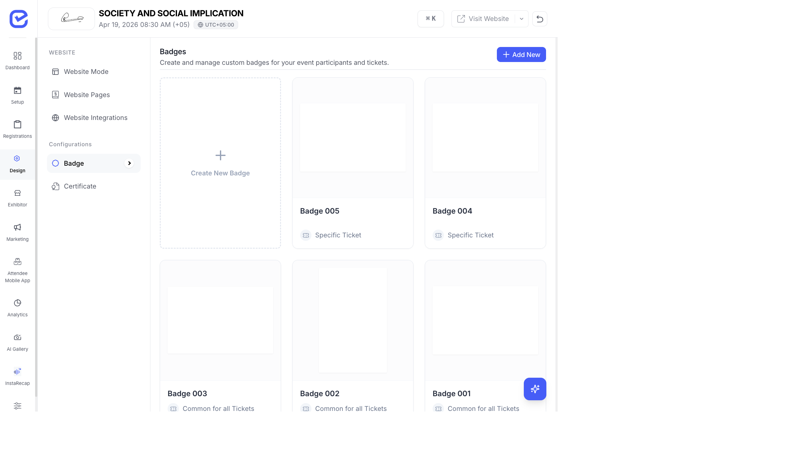
Section titled “Access Badges”Go to Design → Badge in the left sidebar.
The badge page shows all your badge designs as preview cards. Each card shows the badge name and whether it applies to a Specific Ticket or is Common for all Tickets.
Create a New Badge
Section titled “Create a New Badge”- Go to Design → Badge.
- Click + Add New in the top-right corner.
- Choose the Badge Type:
- Common for All Tickets — one badge design used for every ticket type
- Specific Ticket — a unique badge design for a particular ticket
- Common for All Participants — applies to all participant types
- Specific Participant Type — unique per participant type
- Choose the Badge Size:
- Standard Conference — 8.5 × 5.5 cm (landscape)
- Compact Business — 5.5 × 8.5 cm (portrait)
- Large Event — 10 × 15 cm
- Custom Size — set your own width and height in centimeters
- Click Create to open the Badge Designer.
The Badge Designer
Section titled “The Badge Designer”
The Badge Designer has three panels:
| Panel | Purpose |
|---|---|
| Left — Elements | Draggable fields you can add to the badge |
| Center — Canvas | Visual preview of your badge design |
| Right — Layers & Properties | Layer order, element settings, badge size, and background |
Adding Elements to Your Badge
Section titled “Adding Elements to Your Badge”The left panel has two tabs of elements:
These are dynamic fields that auto-populate with each attendee’s registration data.
QR Code — the attendee’s unique QR code (used for check-in scanning).
Form Fields — pulled from your registration form. Common fields include Full Name, First Name, Last Name, Email, Website, Admin Mobile Number, Title/Designation, Country, Organization, and Biography. Any custom form field you created in the Form Builder also appears here.
Drag a field from this panel and drop it onto the badge canvas. The element appears with placeholder text (e.g., “Sample Text”) and will auto-fill with real attendee data when printed.
These are fields from the event itself, the same for every badge.
Available event fields include Event Name, Ticket Name, Location/Venue, Start Date, End Date, Description, Organizer Name, and Contact Number. You can also add a QR Code and a Background Image from this tab.
Customizing Element Properties
Section titled “Customizing Element Properties”Click any element on the canvas to edit its properties in the right panel:
Text Elements
Section titled “Text Elements”- Font Size — 8 to 70 pt
- Line Height — spacing between lines
- Text Color — color picker
- Alignment — horizontal (left, center, right) and vertical (top, center, bottom)
- Style — bold, italic toggles
- Dimensions — width and height in cm
Image Elements
Section titled “Image Elements”- Upload — PNG, JPG (max 5 MB)
- Lock Aspect Ratio — maintain proportions when resizing
- Border — radius, width, and color
- Quick Shapes — square, circle, rectangle, or triangle clip masks
QR Code Elements
Section titled “QR Code Elements”- QR Color and Background Color
- Error Correction Level — L (low), M (medium), Q (quartile), H (high)
- Size — width and height
Layers Panel
Section titled “Layers Panel”The Layers tab on the right panel shows all elements stacked in order. The top layer appears in front on the badge.
You can reorder layers by dragging, and each layer displays the element’s label (e.g., “User QR Code”, “Full Name”, “Organization”).
Badge Background
Section titled “Badge Background”In the Settings section of the right panel:
- Image — upload a PNG or JPG background image (max 5 MB). Use your event branding — gradient backgrounds, sponsor logos, decorative borders.
- Color — set a solid background color instead of an image.
Canvas Controls
Section titled “Canvas Controls”The bottom toolbar provides:
| Control | Function |
|---|---|
| Zoom | Zoom in/out (1%–200%), fit to view, fill mode |
| Smart Guides | Alignment guides that snap elements to edges and centers |
| Grid | Overlay grid for precise positioning |
| Undo / Redo | Step backward or forward through changes |
| Width × Height | Shows the badge dimensions in centimeters |
Preview Your Badge
Section titled “Preview Your Badge”Click the Preview tab at the top (next to Configure) to see how the badge will look with real attendee data. This is essential before printing to catch any layout issues.
Export to PDF
Section titled “Export to PDF”Click the Export PDF button in the top-right corner to generate a PDF of all badges. You can then print the PDF on your badge printer or send it to a print shop.
Print Badges
Section titled “Print Badges”For on-site printing during check-in:
- Go to Design → Badge.
- Select the badge design you want to print.
- Click Print.
- Choose which tickets/attendees to print for.
- Connect your badge printer and print.
Best Practices
Section titled “Best Practices”- Keep it scannable — make the QR code at least 2 × 2 cm so scanners can read it quickly from a distance.
- Prioritize readability — the attendee’s name should be the largest text element. Use 18–24 pt or larger.
- Color-code by ticket type — use different background colors for General, VIP, Speaker, and Staff badges.
- Include essential info only — name, company, and QR code are usually enough. Don’t clutter the badge.
- Test with long names — check that names like “Muhammad Abdulrahman Al-Rashid” fit without getting cut off.