Using the Website Page Builder
The Website Builder is EventHex’s drag-and-drop page editor. Add content blocks (modules), rearrange them, toggle their visibility, and preview how your page looks on desktop, tablet, and mobile — all without writing code.
Open the Page Builder
Section titled “Open the Page Builder”- Go to Design → Website Pages.
- Click Website Builder on the page you want to edit (e.g., Home).
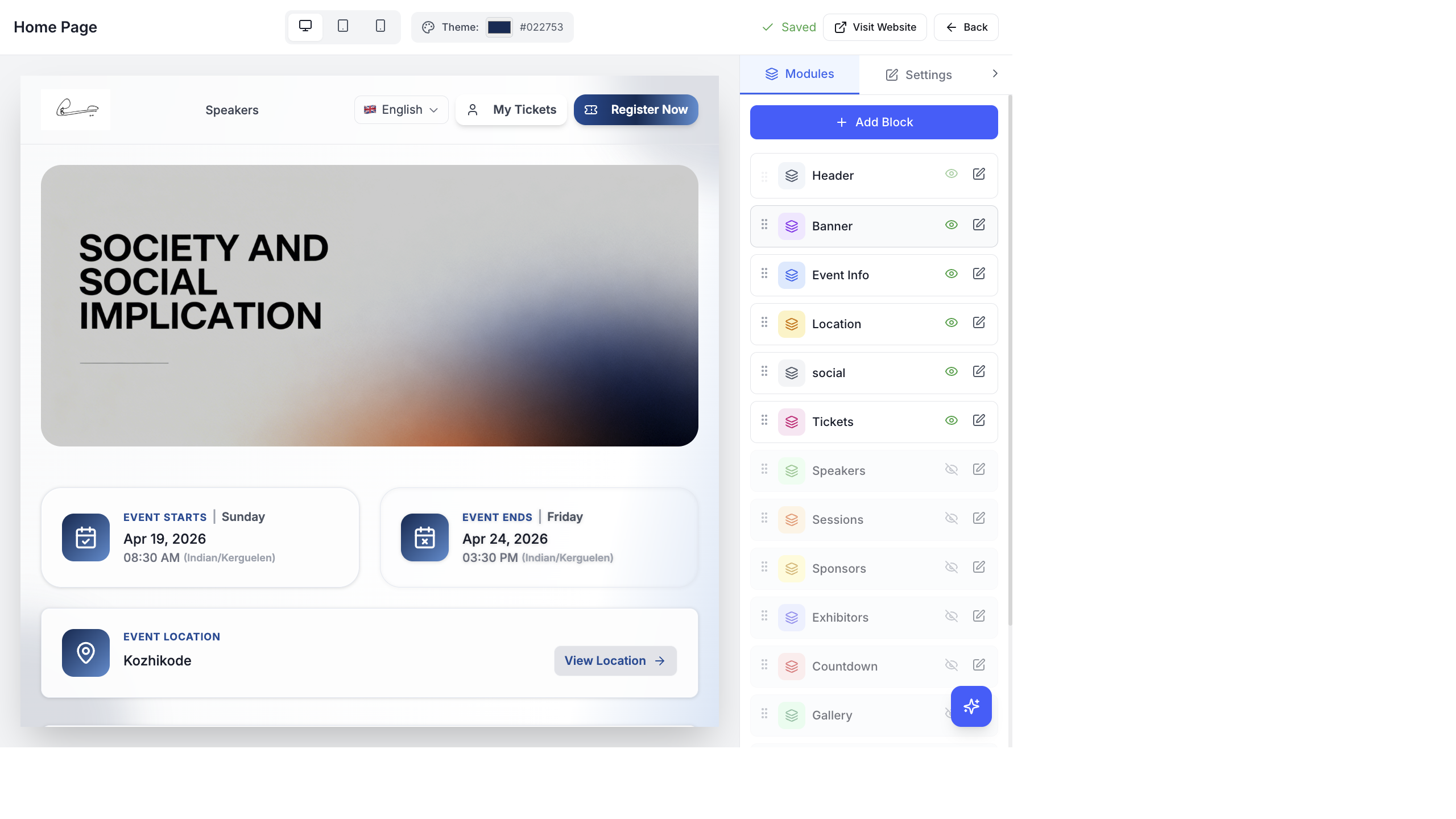
The builder has two areas:
| Area | What It Shows |
|---|---|
| Left — Live Preview | Real-time preview of your website showing exactly how visitors will see it |
| Right — Modules Panel | List of all content blocks. Drag to reorder, toggle visibility, click to edit. |
Available Modules
Section titled “Available Modules”Click + Add Block at the top of the Modules panel to add a new module. Here are all available modules:
| Module | What It Shows |
|---|---|
| Header | Event logo, navigation menu, language switcher, Register Now button |
| Banner | Hero image or image slider at the top of the page |
| Event Info | Event start/end dates, times, and timezone |
| Location | Venue name and “View Location” link |
| Social Icons | Links to your social media profiles |
| Tickets | Ticket cards with pricing and Register button |
| Speakers | Speaker photos, names, and roles |
| Sessions | Session agenda grouped by day and track |
| Sponsors | Sponsor logos and tiers |
| Exhibitors | Exhibitor company profiles |
| Countdown | Live countdown timer to the event |
| Gallery | Photo gallery from InstaSnap |
| Carousel | Image carousel/slider |
| Video | Embedded video player |
| Map | Interactive map showing venue location |
| About | About section with custom text |
| Text + Media | Flexible text and image/video combination |
| Icon Box | Icon-based feature highlights |
| Image | Static image block |
| Custom HTML | Raw HTML for advanced customization |
| WhatsApp chat button | |
| Footer | Page footer with links and copyright |
| Participant Types | Registration categories display |
| FAQ | Frequently asked questions accordion |
| Speakers List | Detailed speaker listing |
| Sessions List | Detailed session listing |
| Sponsors List | Detailed sponsor listing |
| Exhibitors List | Detailed exhibitor listing |
| Gallery List | Detailed gallery listing |
Rearranging Modules
Section titled “Rearranging Modules”Each module in the right panel has a drag handle (⋮⋮) on the left. Click and drag to reorder modules — the live preview updates immediately.
The order from top to bottom in the Modules panel matches the order from top to bottom on your website.
Show or Hide Modules
Section titled “Show or Hide Modules”Each module has a visibility toggle (eye icon):
- Eye open — module is visible on the website
- Eye closed — module is hidden from visitors
This lets you prepare content before revealing it. For example, add the Speakers module early but keep it hidden until you’ve confirmed all your speakers.
Edit Module Settings
Section titled “Edit Module Settings”Click the edit icon (pencil) on any module to open its settings. Each module has different configuration options.
Header Settings
Section titled “Header Settings”The Header module controls the top navigation:
- Custom logo — upload your event logo with size controls (width 60–300 px, height 30–150 px)
- Navigation menu — manage menu items. Add pages (Speakers, Sessions, Sponsors, Exhibitors, Gallery) or custom links. Drag to reorder menu items, toggle to show/hide each item, edit the label text.
- Register Now button — toggle on/off, change button text
- My Tickets button — toggle on/off, change button text
Banner Settings
Section titled “Banner Settings”- Banner type — Single Image or Image Slider
- Banner height — Auto (full image height) or Custom (200–800 px, adjustable with slider)
- Layout type — full-width or side-by-side layouts
- Image upload — add images per slide. For sliders, add and remove individual slides.
- Reset — reset to the default event banner
Theme Color
Section titled “Theme Color”The Theme picker at the top of the builder (labeled with a palette icon and hex code like #022753) sets the primary color for your entire website:
- Button colors
- Link colors
- Accent elements
- Header background tint
Click the color swatch to open the color picker. Enter your brand hex code for consistent branding.
Device Preview
Section titled “Device Preview”Three icons at the top of the builder let you preview how your website looks on different devices:
| Icon | Device | Viewport |
|---|---|---|
| 🖥️ Monitor | Desktop | Full width |
| 📱 Tablet | Tablet | Medium width |
| 📱 Phone | Mobile | Narrow width |
Save and Publish
Section titled “Save and Publish”Changes save automatically as you work (the “Saved” indicator appears in the top toolbar). Your website is live and accessible at your event URL — no separate publish step is needed.
Click Visit Website to open the live website in a new tab and verify your changes.
Delete a Module
Section titled “Delete a Module”Click the trash icon on any module to remove it from the page. The module and its content are removed from the website.
How Modules Render on the Website
Section titled “How Modules Render on the Website”Each module you add in the Page Builder generates a corresponding section on the live event website. The website dynamically renders modules based on your configuration:
- Speakers Widget → grid of speaker cards with photos, names, and roles
- Sessions Widget → agenda listing with date tabs and stage filters
- Exhibitors Widget → exhibitor grid with logos and booth numbers
- Sponsors Widget → sponsor logos organized by tier (Platinum, Gold, Silver)
- Gallery Widget → photo carousel or grid from AI Gallery
- FAQ Widget → expandable FAQ accordion
See Event Website Pages for detailed per-page rendering documentation.