Landing Page Configuration & Templates
Your event landing page is the first thing attendees see. This guide covers how to configure the banner, set display modules, customize the appearance, and create a professional event website without design skills.
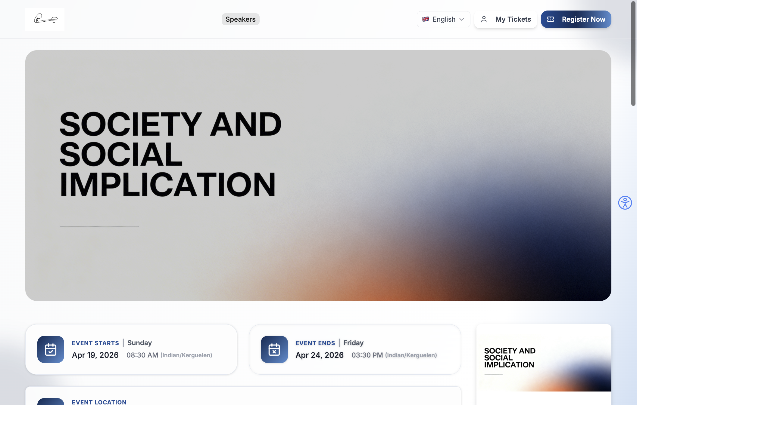
Banner Configuration
Section titled “Banner Configuration”The banner is the hero section at the top of your landing page — the first visual impression visitors get.
Banner Type
Section titled “Banner Type”Open the Banner module settings in the Website Builder (edit pencil icon on the Banner module):
Upload one image that fills the entire banner area. This is the simplest option and works well for most events.
Upload your banner image (recommended: at least 1920 × 800 px for full-width). The image scales to fit the banner area.
Create a rotating carousel of multiple banner images. Useful when you want to highlight different aspects of your event — venue photos, speaker headshots, or past event highlights.
Add multiple slides, each with its own image. Slides auto-rotate. You can add and remove individual slides.
Banner Height
Section titled “Banner Height”- Auto — the banner height matches the full image height. The image displays at its original aspect ratio.
- Custom — set a specific height between 200 px and 800 px using the slider. This crops the image to fit.
Display Modules
Section titled “Display Modules”Control which content sections appear on your website. Go to Settings → Display Modules for a quick toggle view:
| Module | Toggle | What It Shows |
|---|---|---|
| Speakers | On/Off | Speaker profiles on the website |
| Sessions | On/Off | Session agenda |
| Sponsors | On/Off | Sponsor logos and tiers |
| Location | On/Off | Venue information and map |
| Attendees | On/Off | Attendee list (if public) |
| Agenda | On/Off | Simplified agenda view |
| Gallery | On/Off | Photo gallery |
| FAQs | On/Off | Frequently asked questions |
| Contact | On/Off | Contact information |
| Feedback | On/Off | Post-event feedback form |
You can also toggle Meeting Link visible before registration — this controls whether virtual meeting links are shown to visitors who haven’t registered yet.
Appearance Settings
Section titled “Appearance Settings”Configure the visual look of your website. Go to Settings → Appearance:
| Setting | What It Does |
|---|---|
| Primary Color | Main brand color for buttons, links, and accents |
| Secondary Color | Supporting color for backgrounds and highlights |
| Logo | Your event or organization logo |
| Favicon | The small icon shown in the browser tab |
| Theme | Light, Dark, or Custom color scheme |
| Language | Default language for the website |
| Footer Text | Custom text shown in the website footer |
- Go to Settings → Appearance.
- Click the Primary Color swatch and enter your brand hex code.
- Upload your Logo and Favicon.
- Choose a Theme (Light is recommended for readability).
- Set the Footer Text — typically your organization name and copyright year.
- Click Save.
Recommended Landing Page Layout
Section titled “Recommended Landing Page Layout”Here’s a proven layout for high-converting event landing pages. This is the order we recommend for the modules on your Home page:
- Header — logo, navigation, Register Now button
- Banner — eye-catching event image with title
- Event Info — dates, times, timezone
- Location — venue name and address
- Tickets — ticket cards with pricing and registration button
- Speakers — speaker photos and bios
- Sessions — agenda overview
- Countdown — timer creating urgency
- Sponsors — sponsor logos for credibility
- Footer — contact info and social links
The key principle: put the most important information (what, when, where, how much) above the fold, followed by credibility signals (speakers, sponsors), then supporting content.
Common Mistakes to Avoid
Section titled “Common Mistakes to Avoid”| Mistake | Why It’s a Problem | Fix |
|---|---|---|
| No Register Now button | Visitors can’t figure out how to sign up | Enable the Register Now button in Header settings |
| Banner takes full screen | Visitors have to scroll before seeing any info | Set banner height to 400–500 px |
| Too many modules | Page is overwhelmingly long and slow to load | Only enable modules you actually have content for |
| No OG Image set | Social shares look ugly (no image preview) | Upload a 1200 × 630 px OG Image in SEO Settings |
| Menu has 10+ items | Navigation is confusing and overwhelming | Keep to 3–5 menu items |
| Speakers section empty | Shows “No speakers” on a live page | Hide the Speakers module until you’ve added speaker data |
Preview Before Going Live
Section titled “Preview Before Going Live”Before sharing your event website publicly:
- Open the Website Builder and check the Desktop, Tablet, and Mobile previews.
- Click Visit Website to see the live website.
- Test the Register Now button — it should scroll to or navigate to the ticket section.
- Test the My Tickets button — it should go to the attendee login page.
- Share the link on WhatsApp or Slack to yourself — check that the social sharing preview (OG Image, title, description) looks correct.
- Ask a colleague to visit the link and give feedback.
See It in Action
Section titled “See It in Action”For a complete visual walkthrough of what attendees see when they visit your event website, including all pages and interactive elements, see:
- Event Website — The Attendee Experience — full homepage and section walkthrough
- Event Website Pages — detailed per-page breakdown (speakers, sessions, exhibitors, sponsors, gallery, FAQ)